Filter Circles or Venn Diagrams for Contact Plus Professional
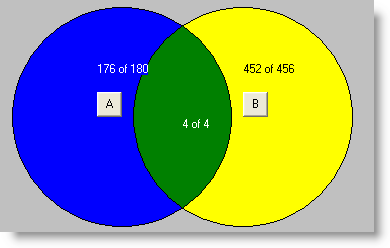
Graphical view of membership using filtersWith the new Filter Circles function in Contact Plus Professional you can better analyze the relationships between your contacts and filters in a visual way. Three separate circles are used to graphically represent membership in a filter. For example, one filter could be based on a category, the second filter based on a geographical area and the third based on a date. So a diagram could show us contacts in category A from California who have been contacted in 2005. The following chart shows that there are 180 contacts in category A (Filter A in BLUE), 456 contacts in California (Filter B in YELLOW) and 4 contacts in both category A and in California (Filters A and B in GREEN).
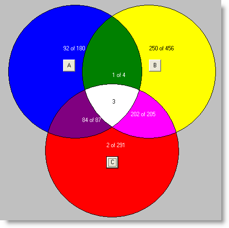
Many other types of filter charts can be produced allowing you to better target your contacts. The diagram below illustrates graphically how much information can be gleaned from 3 different filters:
.
Note that once the filter circles or venn diagrams have been created, you can simply click on one of the colors which will give you a list of all of the contacts that matched that set of people. Additionally the resulting contacts can be marked so you can easily send out a mailing to the new set of contacts. To view a short 5 minute video tutorial on this new addon for Contact Plus Professional click here. | ||||
Contact Management Software Products Task Plus Overview - Introduction Task Plus Overview - Date Oriented Tasks Task Plus Overview - Todos Task Plus Overview - Filters Task Plus Overview - Web Pages and Reports Task Plus Overview - Exporting and Archive Task Plus Overview - Customization News Contact Information Privacy |


